
Responsive Web Design: A Practical Guide for SMEs
What responsive web design means, why Google indexes the mobile version of your site, and a 10-point checklist to test your own website on a phone.
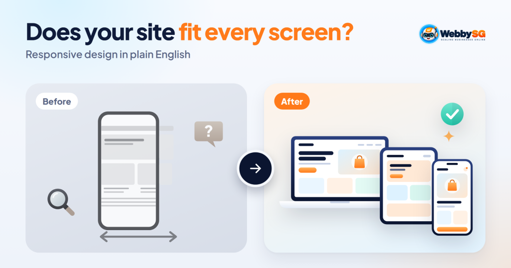
Responsive web design is a way of building a website so that one set of pages automatically adjusts its layout, text and images to fit any screen, from a small phone to a wide desktop monitor. Instead of a separate mobile site, the same page rearranges itself: columns stack, menus collapse, images shrink and buttons grow easier to tap. It matters because Google uses the mobile version of your site for indexing and ranking, and because many of your visitors will first see your business on a phone. If your site makes people pinch, zoom or scroll sideways, you are losing enquiries.
This guide explains how responsive design works in plain English, how it compares with older approaches, and gives you a 10-point checklist to test your own site on a phone in about 15 minutes.
In short
- A responsive site uses one set of pages and one URL for every device. The layout adapts to the screen width.
- Google recommends responsive web design and uses the mobile version of your content for indexing and ranking.
- Your mobile pages should carry the same main content as desktop. Content missing on mobile can cost you search traffic.
- The most common mobile problems are small tap targets, sideways scrolling, unreadable tables, pop-ups covering content and slow, oversized images.
- Most issues can be found by an owner with a phone and fixed by a developer without a full redesign.
What responsive web design means
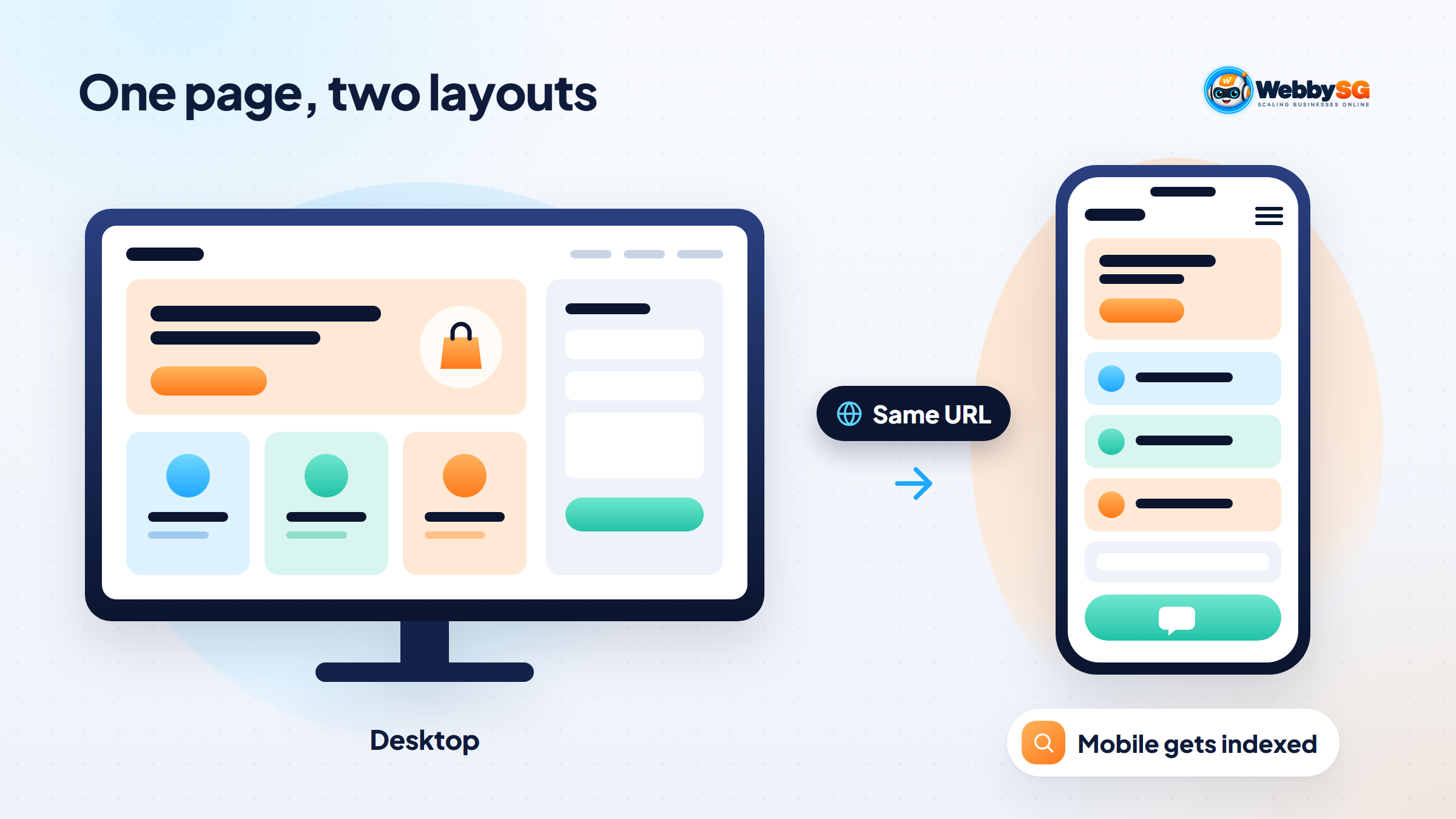
Before smartphones, websites were designed for a desktop screen of roughly fixed width. When phones arrived, many businesses built a second, cut-down "m-dot" site (m.example.com) for mobile visitors. Responsive web design replaced that with a simpler idea: build one site whose layout responds to the size of the screen it is shown on.
A simple example: on a desktop, a service page might show three service cards side by side, a horizontal menu and a contact form next to the text. On a phone, the same page shows the cards stacked one above the other, the menu tucked behind a menu button, and the form below the text, with a full-width "WhatsApp us" button. The content and the URL stay the same; only the arrangement changes.
How a responsive site works (without the code)
Three ideas do most of the work. Google's responsive web design basics on web.dev covers them in detail for developers.
- The viewport setting. A single line in the page code tells phones to display the page at the device's real width. Without it, phones render the page as if on a desktop of about 980 pixels and zoom out, so text becomes tiny. The same guidance warns against settings that stop people zooming, because that harms accessibility.
- Flexible layouts. Instead of fixed pixel widths, page sections are sized in proportions, using modern layout tools such as flexbox and grid. Content then fits the screen and visitors only scroll up and down, never sideways.
- Breakpoints. At certain widths the layout changes, for example from three columns to one. Good practice is to set breakpoints where the content starts to look cramped, not for specific phone models, and to design for small screens first.
Images follow the same logic: they scale down to fit their container, and well-built sites send smaller image files to phones so pages load faster. Text is sized for comfortable reading, with web.dev citing roughly 70 to 80 characters per line as a comfortable reading width.
Responsive vs adaptive vs separate mobile sites
| Approach | How it works | Pros | Cons |
|---|---|---|---|
| Responsive | One set of pages and URLs; layout adapts fluidly to any width | One site to maintain; same content everywhere; Google's recommended pattern | Needs careful design so every page works at every width |
| Adaptive (dynamic serving) | Same URL, but the server sends different HTML depending on the device | Can tailor pages tightly to device types | More to build and test; device detection can go wrong |
| Separate mobile site (m-dot) | A different site on a different URL for phones | Fully separate mobile experience | Two sites to update; content often drifts apart; more SEO set-up |
Google's mobile-first indexing guidance lists all three configurations but states that Google recommends responsive web design because it is the easiest pattern to implement and maintain. For a Singapore SME, there is rarely a good reason to choose anything else. WordPress, Shopify and Wix themes are almost all responsive by default; problems usually come from how the content and add-ons were put together.
Why responsive web design matters: mobile-first indexing and your visitors
Google states that it uses the mobile version of a site's content, crawled with its smartphone crawler, for indexing and ranking. A few practical consequences follow from the same guidance:
- Content parity matters. Your mobile pages should contain the same main content as desktop. Hiding content in tabs or accordions on mobile is fine; removing it is not, and Google warns you can expect some traffic loss if the mobile version has less content.
- Lazy-loaded content must load on its own. Google says it won't load primary content that only appears after someone swipes, clicks or types, so a "load more" button hiding your service list is a risk. Content already in the page inside an accordion is fine.
- A mobile version is not strictly required to appear in search, but Google very strongly recommends it.
Then there are the people actually using your site. Picture someone on the MRT home from work, searching for "aircon chemical wash Tampines" with one thumb. They open three results. If your phone number will not tap to call, your form fields are tiny or your price list needs pinching and zooming, they go back and pick one of the other two. That is how a site that looks perfectly fine on your office monitor quietly loses enquiries.
A 10-point checklist to test your site on a phone
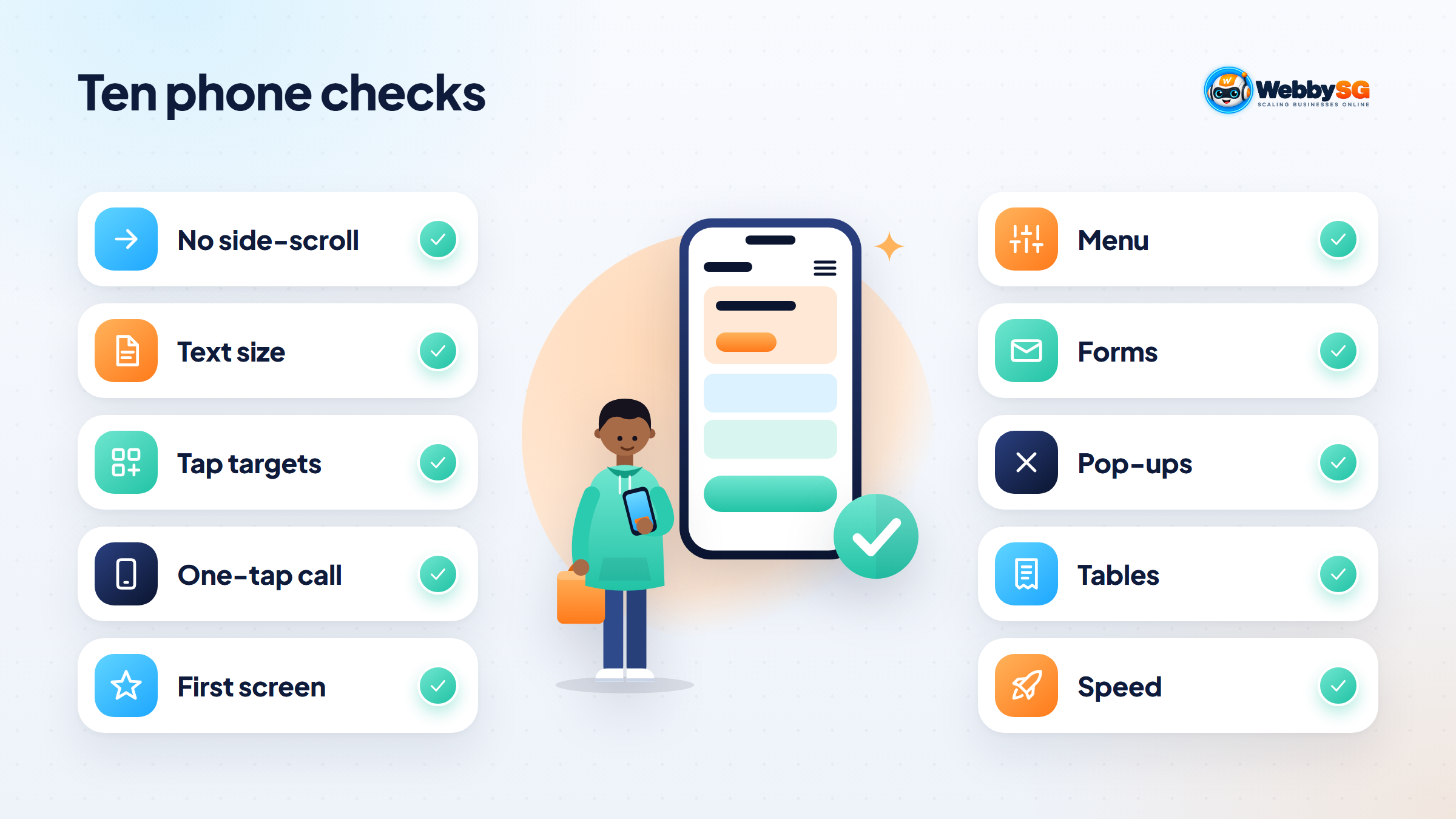
Use your own phone, ideally on mobile data rather than office Wi-Fi, and test your homepage, your most important service or product page, and your contact page. Ask a colleague with a different phone to repeat it.
- No sideways scrolling. Drag the page left and right. Nothing should move horizontally.
- Readable without zooming. Body text should be comfortable to read at arm's length.
- Tap targets are easy to hit. Buttons, menu items and links should be easy to tap with a thumb without hitting the wrong one. WCAG 2.2 sets a minimum of 24 by 24 CSS pixels at Level AA and 44 by 44 at the stricter Level AAA; aim for the larger size for key buttons.
- Phone and WhatsApp work in one tap. Tapping your number should open the dialler; your WhatsApp link should open a chat.
- The main message is visible on first load. Without scrolling, can you tell what the business does and what to do next?
- The menu opens and closes cleanly and every important page is reachable from it.
- Forms are easy to fill. Fields are full width, the right keyboard appears for phone and email fields, and errors are explained clearly.
- Pop-ups do not block the page. Cookie banners, chat widgets and promotions should be easy to close and should not cover the call button.
- Tables and pricing are readable. Wide tables should scroll within their own box or stack into cards.
- Pages load quickly on mobile data. If the first screen takes several seconds, large images or scripts are usually the cause.
Count how many fail. One or two are quick fixes. Five or more usually means the theme or page builder set-up is the problem, which is when a structured website UX audit pays off.
Common mobile problems and how they get fixed
| Problem you notice | Usual cause | Typical fix |
|---|---|---|
| Page scrolls sideways | An element with a fixed width, such as a wide image, table or embedded map | Make it scale to the screen or scroll inside its own container |
| Tiny text that needs zooming | Missing viewport setting or desktop-sized fonts | Add the viewport setting; set larger mobile font sizes |
| Buttons too close together | Desktop spacing reused on mobile | Increase button size and spacing at small widths |
| Pop-up covers the page | Promo, chat or cookie widget set up for desktop | Use a smaller banner, delay it, or show it only on desktop |
| Slow first load | Large hero images, sliders, too many plugins or scripts | Compress and resize images; remove sliders and unused scripts |
| Content missing on mobile | Sections hidden on small screens in the page builder | Show the content, using accordions if space is tight |
| Form hard to complete | Too many fields, small inputs, CAPTCHA issues | Cut fields, enlarge inputs, use the right input types |
If the site is old enough that fixes keep breaking other things, a rebuild on a modern responsive theme can be cheaper than patching. Our guide to web design services in Singapore explains what a redesign usually includes, and for smaller ongoing fixes a website maintenance plan keeps things from drifting after updates.
Getting your site working properly on phones
Start with the checklist and note what fails on which page. Send that list, with screenshots, to whoever maintains your site. Most issues are fixed in the theme or page builder settings rather than by rewriting content.
If you are planning a new site or a redesign, Webby SG's web design service designs every page for phones first and tests it on real devices before launch. If you would like us to look at how your current site performs on mobile, get in touch.
Frequently asked questions
What is an example of responsive web design?
A service page that shows three columns of cards on a desktop, two on a tablet and a single stacked column on a phone, with the menu collapsing behind a menu button. The URL and content stay the same on every device. Most modern WordPress, Shopify and Wix themes work this way.
Is responsive design the same as mobile-friendly?
Not exactly. Mobile-friendly describes the result: a site that is easy to use on a phone. Responsive design is one way to achieve it, by adapting a single site to every screen. A responsive site can still be unfriendly on mobile if it has tiny buttons, intrusive pop-ups or slow images.
Does Google penalise sites that are not responsive?
Google does not describe it as a penalty, and a mobile version is not strictly required to appear in search. But Google indexes and ranks the mobile version of your content, so a poor mobile experience or missing mobile content can hold rankings back. Google recommends responsive design as the easiest pattern to maintain.
How do I make my existing website responsive?
If the site runs on a modern CMS theme, it is probably responsive already, and the work is fixing individual problems from the checklist. If it is an older custom or fixed-width site, the usual route is moving to a responsive theme or rebuilding the templates. Get a developer to check whether fixing or rebuilding is cheaper.
What is mobile-first design?
Mobile-first design means designing for the smallest screen first, deciding what matters most there, then adding layout for larger screens. It tends to produce clearer pages because it forces priorities. It is related to, but different from, Google's mobile-first indexing, which is about which version of your site Google uses for indexing.